Once again, I’m looking at platformers, but today we will be remaining firmly in the realm of two dimensions and red-themed names, with Metroidvania title Transiruby and kinda-sorta-Metroidvania-like Flynn: Son of Crimson.
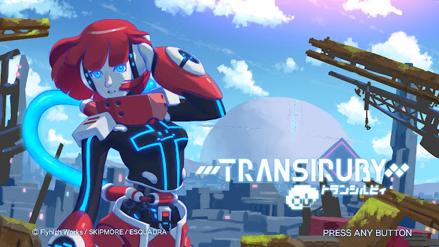
Transiruby (SKIPMORE)
I’ve said in the past that the Nintendo Switch is a great platform for indie games, but this was even more true early in the console’s life. It was much easier for a small but well-made game to stand out in the eShop back when there just wasn’t as much on the console. One of the big beneficiaries of this was Kamiko (which you may recognize from waaaay back in my 2017 year-end round-up), a title by solo Japanese developer SKIPMORE that was released about a month and a half after the console launched. I had heard basically nothing about it when I saw it while browsing the eShop for new games to try. There weren't a ton of bigger games overshadowing it yet, it wasn’t expensive, and it looked solid, so I gave it a shot and enjoyed myself.
I hadn’t thought much about it lately, until I was browsing upcoming games and saw Transiruby. Once again, it looked like a cute little 8-bit Metroidvania. Of course, given the current crowd of the eShop, that wasn’t enough to just give it a try on a whim; so I looked into it a little more, at which point I went “Oh shoot, this is the Kamiko guy!”, which was enough to convince me (although for those who don’t have that past experience, there is also a Steam demo you can give a whirl to see if it’s your thing).
And what I found was… basically an experience a lot like a more-developed, more-polished Kamiko: a fun little game with solid fundamentals and visuals that get the most out of their simplified 8-bit aesthetics, with clean sprites on vibrant and colorful backgrounds.* Maybe that’s a little surprising, but as I’ve noted in the past, there’s a lot of similarities in the core design of Metroidvanias and Top-Down A-A games, and SKIPMORE understands what each one needs specifically to build on those basics. And there’s a definite shared identity between the two games as well, from a lot of reused sprites and visual stylings, to a similar basic health and energy mechanic gameplay loop, to a playable character from the earlier game reappearing as a major character in Transiruby.
*I’m actually shocked how much of an improvement the visuals are; not that either game is bad, I just kind of assumed there was a ceiling on good 8-bit pixel art. But after going back to try Kamiko for this, and there’s noticeably more polish and detail, especially in those backdrops. They still aren’t overly complex or anything, but it does stand out, I think.
But let’s go back to the basic question; what makes Transiruby good? Well, perhaps the most crucial thing for this style of game, the movement feels really good. It’s all very fluid, you move at a good speed for the size of the world, player character Siruby* is responsive to sharp turns and jumps and other sudden moves if you want to maneuver around obstacles, your attacks are reliable and predictable… It’s all of that stuff that really stands out when it’s wrong, but which can go unnoticed when it works. But I had, for instance, zero problems with running across large chunks of the map to explore for secrets of my own volition; just wandering around felt smooth and fun. This was actually something I liked about Kamiko too, I realized while going back to it for this piece, so it’s nice to see that focus came back.
*The playable character, as seen on the game’s title screen, is a red android girl, so I assumed her name would be Ruby; that feels like a fairly common name for a female character, and would be reasonably fitting as a red-colored robot. But no, it’s Siruby. I suppose it’s still a combination of “Transport” and her name either way, so it’s not a huge shock, but I still found it funny how much the small twist caught me off-guard.

Transiruby makes it really easy to move and do basic platformer inputs with consistent intentionality, which is maybe the most important thing a game like this can do. You might find something that you can’t do, but it never feels like something you should be able to. For example, Siruby’s basic attacks are mostly tied to the four cardinal directions, but there was never a moment where I felt like I needed more than that. There are times when I failed a jump, but it was usually very clear when I did that I had either misjudged something in my movement, or that I wasn’t supposed to be going that way.
It also helps that the world’s map is well-designed. Again, it’s clear when you aren’t “supposed” to be going a specific way (either through some sort of block or dead end), but it’s also usually designed in such a way that it is very clear when there will be a reason to return later (usually either a shortcut or backtrack, although sometimes more). The world mostly reveals itself in chunks, with the collectables you need to progress marked on a map in your newly-accessed region. And even when you’re kind of lost at where to go, there are markings telling you if you’re in the right sector, making the challenge a puzzle of how to get to somewhere rather than wandering all over creation (although there are secret, more spread-out special collectibles for those with good memories).
And going back to the movement, it helps that all of the upgrades fit Transiruby’s core design, feeling smooth and easy-to-use, and having functionality as moves or attacks outside of unlocking progression. The Metroidvania-standard double jump feels good to unlock thanks to both how good the basic jump feels and how many paths the second one opens up. The speed-up mechanic is a lot of fun to use. Improvements to the gun gradually make it so much more usable, from a niche tool to something you can use as much as your standard sword attack. Even the final world drops a surprising-yet-fun final movement option on you.
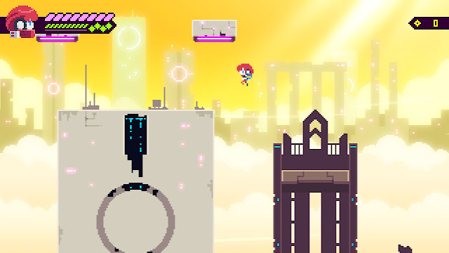
In all, Transiruby is rather straightforward, but so well-made in its simplicity and so fun to play that its dozen or so hours of playtime sped by; I don’t at all regret picking it up. In fact, I enjoyed it enough that I went back and made a second file to attempt speedrunning it, using my carried-over knowledge. I don’t do a ton of replays, and almost never back-to-back like that, so it’s definitely high praise in my books.
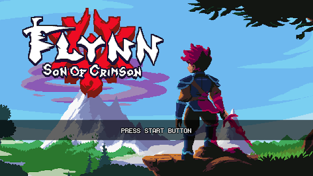
Flynn: Son of Crimson (Studio Thunderhorse)
I don’t really have any sort of extended backstory with how I came across Flynn: Son of Crimson, like I do with Transiruby; some developers I follow on Twitter tweeted about its Kickstarter campaign a few years ago, I was impressed with what I saw, so I backed it. And last year, after four-plus years of development, it finally released.
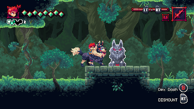
And a lot of what makes it work so well is the same thing that sold me on the Kickstarter back then, and will probably come across even through the release trailer. The game is gorgeous as hell, with some of the lushest pixel art scenery and highly-animated character sprites you’re going to find in a game. It’s also just as smooth and fluid to play as it looks, with every movement option straightforward and easy to use, and full range of attacks to unlock, all balanced and each with their own clear purpose. It’s simply everything you could want out of an hack-and-slash-y action-platformer.
As I alluded to back in the intro, Flynn isn’t really a Metroidvania. Subgenre classifications are always a little fuzzy, and I think you could argue that it has all the requisite elements to classify as one (albeit remixed into slightly different forms), but it’s certainly not an argument that would appease purists. At its core, it’s still a bunch of levels served up in a world map, just as you’ll see in a whole host of 2D platformers. But Flynn drew me in much more than most of those thanks to a design choice: making the world map a branching affair, thanks to levels with multiple exits.
This is something that I’ve always appreciated in platformers (especially growing up on Super Mario World, which is maybe the most notable use of it?); it’s a simple but neat little bonus element that adds a lot of fun options to your level design. A lot of them, like hunting for secrets or noticing how new abilities can open up new paths in old levels, scratch the same sorts of itches as Metroidvanias, but with less backtracking and need for total map connectivity and everything else that comes with making a full-on Metroidvania.
It’s also weirdly rare? Like, I don’t know if it’s uncommon enough to count it as a fully Orphaned Mechanic (my term for gameplay choices that have gone underutilized since their introduction, by their originators or otherwise). And yet… despite being a fairly basic mechanic and having a solid history, it feels like there should be an absolute plethora of recent examples of it.
Seriously, how many games can you think of that have used it? For as much as platformers dominated the indie game scene for years, it seems like most of them either stuck to making puzzle-platformers, or went the route of a true Metroidvania. I feel like I should be able to think of at least three or four examples outside of Flynn that have played with their level design this way in that time, and I’m mostly drawing a big blank. The only one that I can think of is the Mario series itself, which would eventually circle back around to the idea in 2012 with New Super Mario Bros U, a full 21 years after its most recent appearance back in World and four games into the New subseries of Mario games (although some of the early titles flirted with overly-simplified variations of the idea). But that’s basically it, and even that example is a decade old at this point!
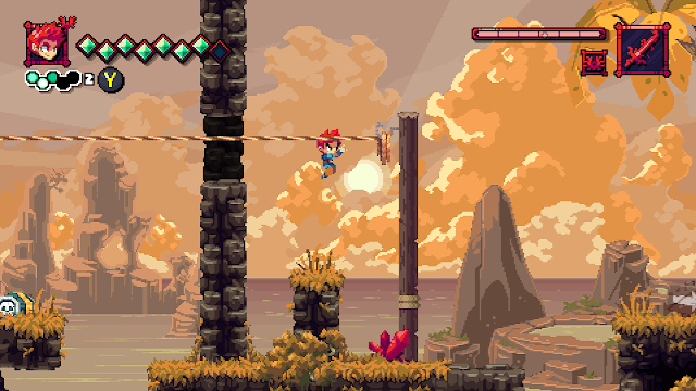
But Flynn: Son of Crimson is finally another entry in the canon, and it does things with its own style. Much like SMW, there’s a pattern to the overworld, showing you which levels to focus your searches on even while not explicitly telling you that. There’s a mix of extra exits, too; some are secrets leading to bonus challenges and areas, incentivizing exploring around the level’s edges. Others are clearly telegraphed, telling you at the beginning to come back later once you have a specific upgrade, giving you access to another path (this is the spirit that makes me most willing to consider it at least Metroidvania-inspired) and often another chapter to the game’s story.
I know the big thing about Metroidvania for a lot of people is the elements of discovery and exploration, and if that’s your favorite part of them, then you might not be as big a fan here; there are some secret to hunt for, but it’s nowhere near what you’d find in even smaller full-on Metroidvania titles (like, say, Transiruby). Flynn does have some of that, but only enough to break things up every now and then; the story keeps moving forward at a decent pace, otherwise. But I think that interconnection of the game world can serve other purposes, and Son of Crimson does a lot in exemplifying those uses.
It makes the whole world feel more complete, like a real place. Levels’ settings and backgrounds progress naturally, like gradually procession from a forest, past the coastline, then up a mountain, before coming to a fork that can lead you in multiple directions (and when you return later to take an alternate path, the developers get to reuse at least some of their art, since they generally made entirely new backgrounds between levels; it’s actually really impressive how much unique art there is here).
And you get the fun moments of foreshadowing, where a path will obviously be blocked of by something, and you get to build anticipation at what gear will help you traverse it later, or where it might lead to, plus all of the satisfaction of returning once you know you have what you need to move on. I’ve come to appreciate that as a sort of storytelling that is specific to video games, and I think Studio Thunderhorse has a good grasp of it, in a way that helps make Flynn: Son of Crimson feel extra cinematic.
In the end, I don’t think Flynn is a new and revolutionary concept in most senses. But, I do think it is an incredibly well-polished 2D platformer with smooth, fun-to-perform actions and attacks, beautiful sound and art production, and enough good design sense and interesting ideas pulled from different sources to make things still feel special.
No comments:
Post a Comment